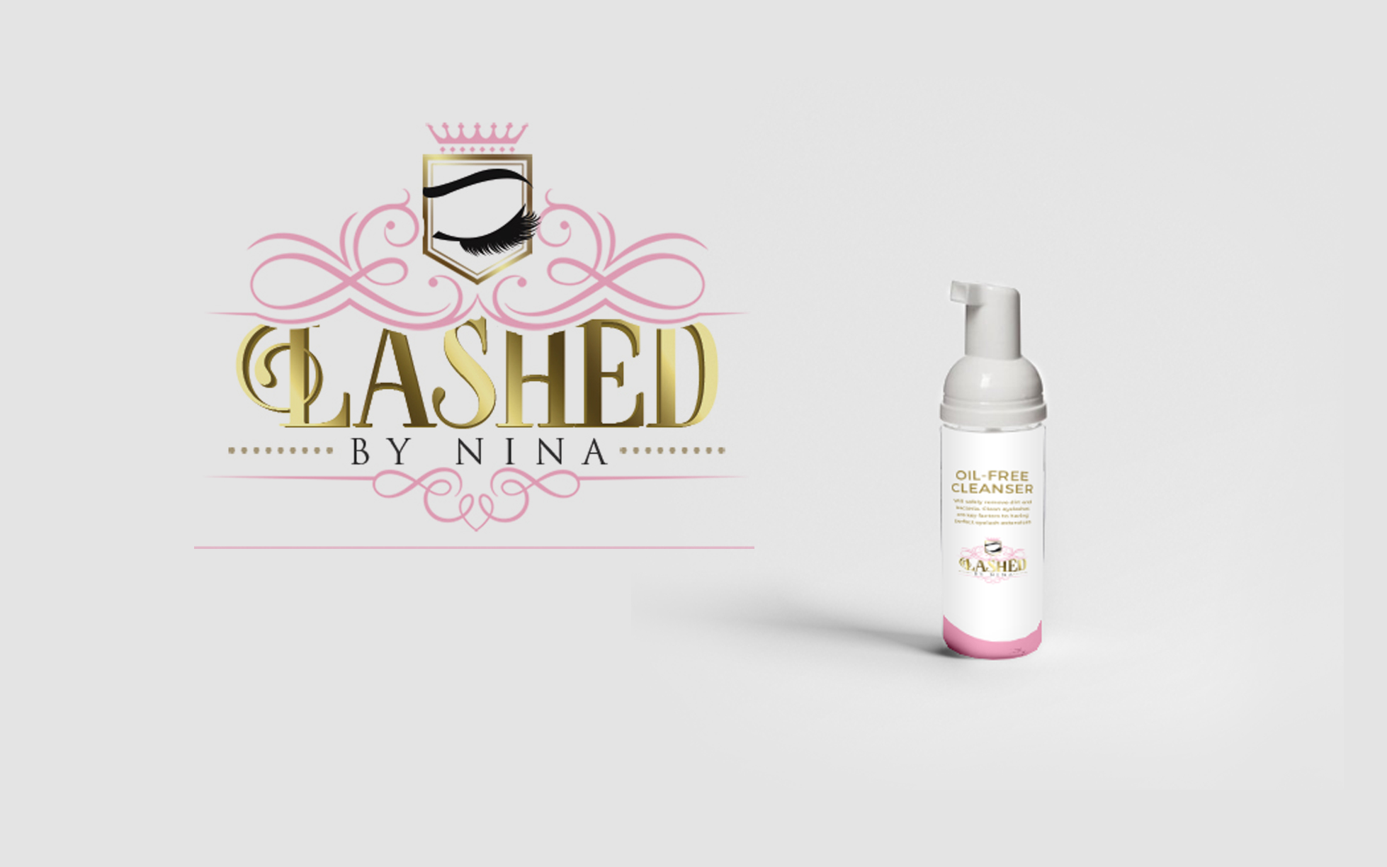
[vc_row full_width=”stretch_row” equal_height=”yes” content_placement=”middle” css=”.vc_custom_1477916391920{margin-bottom: 80px !important;background-color: #ffffff !important;}”][vc_column width=”1/2″ css=”.vc_custom_1477935187461{padding-top: 0px !important;}”][vc_custom_heading text=”Logo Design + Print” font_container=”tag:h6|font_size:25px|text_align:left|color:%23dddddd” use_theme_fonts=”yes” text_transform=”uppercase” css=”.vc_custom_1514487303741{margin-bottom: 10px !important;}”][ut_header align=”left” title=”Lashed By Nina” title_color=”#252525″]Creating a strong brand in an industry that is growing fast![/ut_header][ut_social_share_bar share_text=”SHARE:” border=”true” share_text_color=”#252525″ icon_color=”#999999″ border_color=”#efefef”][/vc_column][vc_column width=”1/2″ css=”.vc_custom_1477935191889{padding-top: 0px !important;}”][ut_animated_image size=”large” align=”center” animate_once=”yes” effect=”fadeIn” image=”5017″][/vc_column][/vc_row][vc_row full_width=”stretch_row” css=”.vc_custom_1477916398261{margin-bottom: 80px !important;background-color: #ffffff !important;}”][vc_column width=”1/2″ css=”.vc_custom_1477935232537{padding-top: 0px !important;}”][ut_animated_image size=”large” align=”center” animate_once=”yes” effect=”fadeIn” image=”5019″][vc_custom_heading text=”Promotional Material” font_container=”tag:h3|text_align:left|color:%23252525″ use_theme_fonts=”yes” text_transform=”uppercase”][vc_column_text]Kierra found that a large portion of her business comes from social media. Her industry thrives from social media feedback. I created a few digital, and printable flyers using strong pinks, purples, lots of serifs, and lots of light.[/vc_column_text][/vc_column][vc_column width=”1/2″ css=”.vc_custom_1477935236742{padding-top: 0px !important;}”][ut_animated_image size=”large” align=”center” animate_once=”yes” effect=”fadeIn” image=”5018″][vc_custom_heading text=”Brand Collateral” font_container=”tag:h3|text_align:left|color:%23252525″ use_theme_fonts=”yes” text_transform=”uppercase”][vc_column_text]Kierra wanted to ensure that her logo was true to her personal design style. We incorporated a modern femininity. She is a fan of stripes, black, white, and a soft pink. The eyelashes are extreme and long and chic. The serifs and wavy lines help to support the feminine energy, and the also emphasize the idea of brushing a long lash.
After we established the overall look and feel of the brand, the goal was to create consistent collateral. This included business cards and labels for her eyelash cleaner. I used the bold black on one side of the card and the soft white and pink on the reverse side. I was pleased to see that the logo works well on either color.[/vc_column_text][/vc_column][/vc_row][vc_row equal_height=”yes” content_placement=”middle”][vc_column css=”.vc_custom_1477935263955{padding-top: 0px !important;}”][vc_custom_heading text=”Graphic Design” font_container=”tag:h6|font_size:25px|text_align:center|color:%23dddddd” use_theme_fonts=”yes” text_transform=”uppercase” css=”.vc_custom_1514493835043{margin-bottom: 10px !important;}”][ut_header align=”center” title=”Manual Design + Print” title_color=”#252525″ css=”.vc_custom_1514493873654{margin-bottom: 60px !important;}”]An Instruction Manual teaching the fundamentals of Eyelash Extensions[/ut_header][/vc_column][/vc_row][vc_row][vc_column][ut_animated_image size=”large” align=”center” animate_once=”yes” css=”.vc_custom_1514491372465{margin-bottom: 60px !important;}” effect=”fadeIn” image=”5020″][vc_row_inner][vc_column_inner width=”1/2″][vc_custom_heading text=”Instruction Manual” font_container=”tag:h3|text_align:left|color:%23252525″ use_theme_fonts=”yes” text_transform=”uppercase”][vc_column_text]Kierra assists women who aspire to do the same work by getting them started with workshops. In these workshops, she instructs them on the fundamental of her practice. The industry has seen tremendous growth over the past year, so she has been able to benefit monetarily from the growing interest with her workshops.
I was asked to create instruction manuals where her students can follow her as she presents the information. The manuals are 11×17 and about 10 pages. Each page highlights a different area of installing lash extensions.
They are printed on heavy gloss paper which is true to the colors, and allows the text to be easily read without blurring.[/vc_column_text][/vc_column_inner][vc_column_inner width=”1/2″][vc_custom_heading text=”Moving Forward” font_container=”tag:h3|text_align:left|color:%23252525″ use_theme_fonts=”yes” text_transform=”uppercase”][vc_column_text]Lashed by Nina is a brand that is expanding every quarter. Kierra is constantly thinking of new ways to build on the strong foundation she’s already established. Moving forward, I’ve made it easy for her to access her logo, and branding elements, in case she wants to use them for projects that don’t require much design work.
Her Style Guide allows her to quickly access her logo in various formats, and reference her hexidecimal colors for accuracy. Typography is also a major part of the style guide. The way her fonts are used and the way accompanying fonts should be used in documents is always a major part of a brand.[/vc_column_text][ut_portfolio_details style=”inline” values=”%5B%7B%22title%22%3A%22CLIENT%3A%22%2C%22description%22%3A%22Lashed%20by%20Nina%22%7D%2C%7B%22title%22%3A%22DATE%3A%22%2C%22description%22%3A%22June%202017%22%2C%22is_link%22%3A%22true%22%7D%2C%7B%22title%22%3A%22CATEGORY%3A%22%2C%22description%22%3A%22Brand%20Design%22%2C%22is_link%22%3A%22true%22%7D%5D” title_color=”#252525″][ut_social_share_bar share_text=”SHARE:” border=”true” share_text_color=”#252525″ icon_color=”#999999″ border_color=”#efefef”][/vc_column_inner][/vc_row_inner][/vc_column][/vc_row]

